Biography
Programs used: 
April, 2013
April, 2013
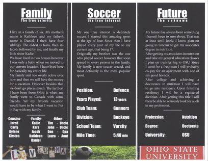
For my biography I wanted to go with a very professional clean and sleek look. To accomplish this i wanted the layout to be very simple and very clean. So for the first page i went with just a text with a small picture fade to make it look very clean and to the point. At the time I also decided that I would follow suit with the rest of the project. However i felt that with only typography decorating the page it lacked color and interesting design. I fiddled around with a couple designs to create more color. After a bunch of failed attempts I finally decided to go with just a picture that represented the subject that was being talked about. This is how I came to the finally design that has the pictures at the bottom.
I was very pleased with this project and there is very little that I would change. However if I were to actually change something I would change the back of the project. I thought that the back did not flow as well and lacked some needed design elements. I think if I were to redo this portion I would just go back and redesign how I did the back part.

