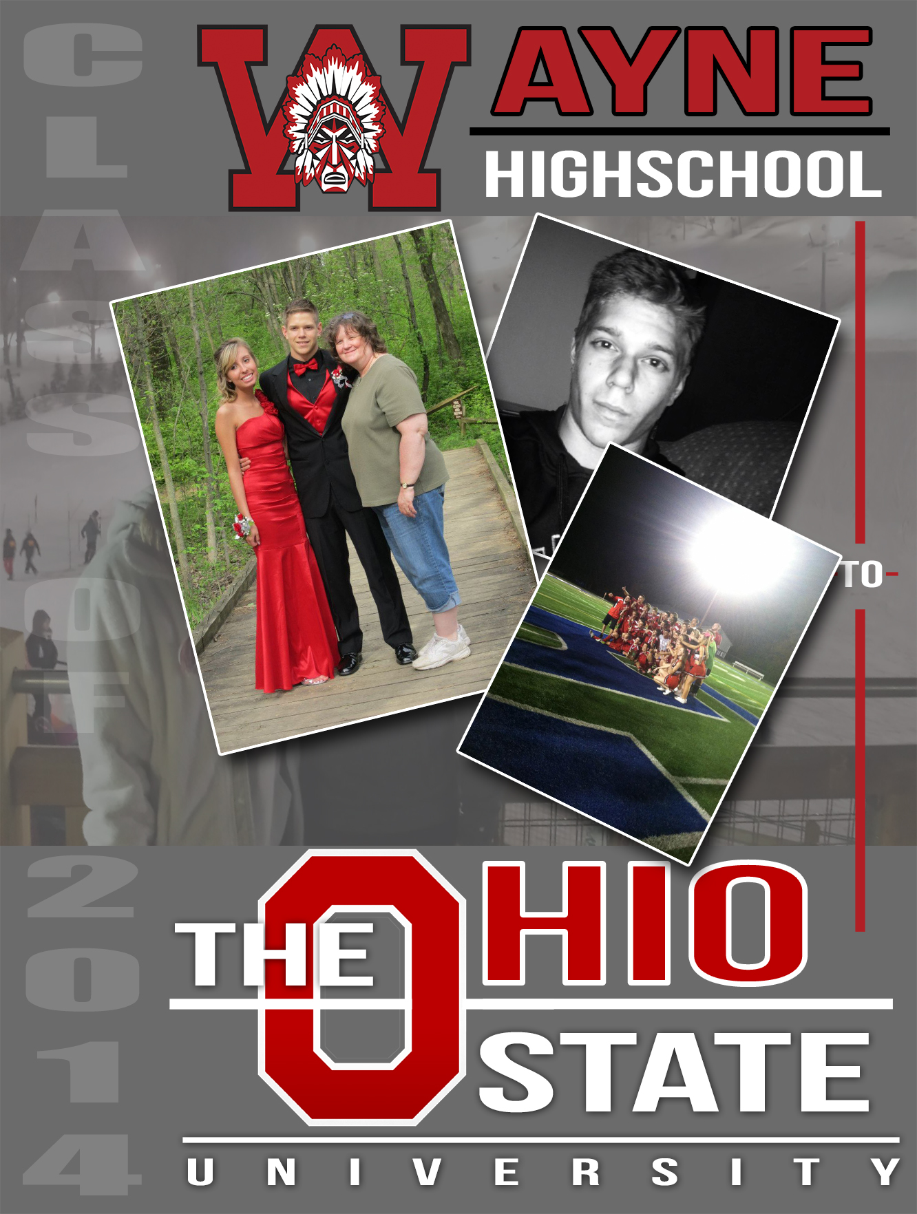
Gradutation Poster
Programs used: 
April, 2014
April, 2014
At first with the graduation poster I had a hard time due to a lack of direction that I wanted to take with the poster. I wasn’t sure how I wanted to lay it out or how to make the theme of the poster. After a bit of thinking I looked over at a colleagues project. My colleague had used the school that he is going to in his poster and from that I got the first part of the direction that I wanted to take in my poster. So I started designing the typography that I was going to use to represent The Ohio State University. After completely the typography I still lacked a bit of direction with the project and was still completely unsure of what to do with the graphic I had just created. I then added a “class of 2014” down the left hand side of the paper to represent the class that I was from. At this point I moved the Ohio State typography to the bottom of the page and that’s when it hit me. I was going to create another typography graphic to represent Wayne and place it at the top of the page. From there I connected the to graphics with a line and placed the word “to” in the middle. I did this to show the transition from my high school to my college or in other words a big part of graduation. I then used all the boundaries created by text and lines to create my content area. I decided to go with a minimalistic feel and only throw in a couple pictures then add a border and drop shadow to make the pictures feel more realistic on the page. Finally I finished it off by adding a large-scale photo through the background. This started off as just the original sized picture I had no yet edited. However upon moving it and editing it I realized it added a sort of diversity to the background that I enjoyed. So I moved the picture back and dropped the opacity. At this point I felt as if it was good enough and I printed it out.
Going back there isn’t much I would have changed about this project. I may have added some subtle gradient to try and add more diversity and dynamics to the project. I also would probably adjusted the typographies more in order to free up extra space for the content area to try and expand upon it. However overall I was very pleased with the outcome of my project.