Magazine
Programs used: 
January, 2013
January, 2013
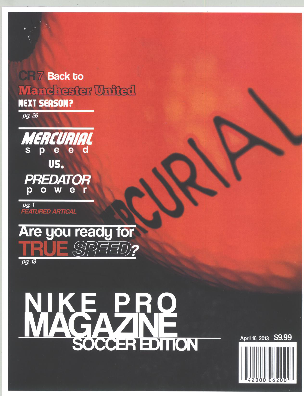
For my magazine cover originally I planned on going with the classic magazine look. Title of top articles on both sides then a barcode on the bottom left. However once I settled on the picture that I was going to use for the cover I quickly changed my outlook on the project. I created the title using basic typography and realized that the title just fit a lot better in the lower left hand corner of the magazine. Even though I thought it would have been better to place the title at the top of the magazine I just couldn’t pull myself to do it and kept the title placed in the lower left where I felt It better flowed with the Image. After that instead of going for the more chaotic look most magazines have I decided to try out a more simplistic look, just very clean and to the point.
As far as the article went I was hoping to tie the theme in a bit to the style of the front cover to give it a more universal feel. However quickly on I realized that that wasn’t going to work out. After I had that realization I quickly lost the direction I had for my article. I was failing to put the images I had in my head onto the page and was struggling on a very eye-pleasing look for the page.
Going back if I had more time on the project I would just work on the article of the magazine and fine-tune if not completely redo the design. I believe that If I could have found a better design for my article then I would have created a much better looking project. Yet the article really diminished the look and feel of my front cover however and I feel as if it brought my project down.

