Menu
Programs used: 

February, 2013
February, 2013
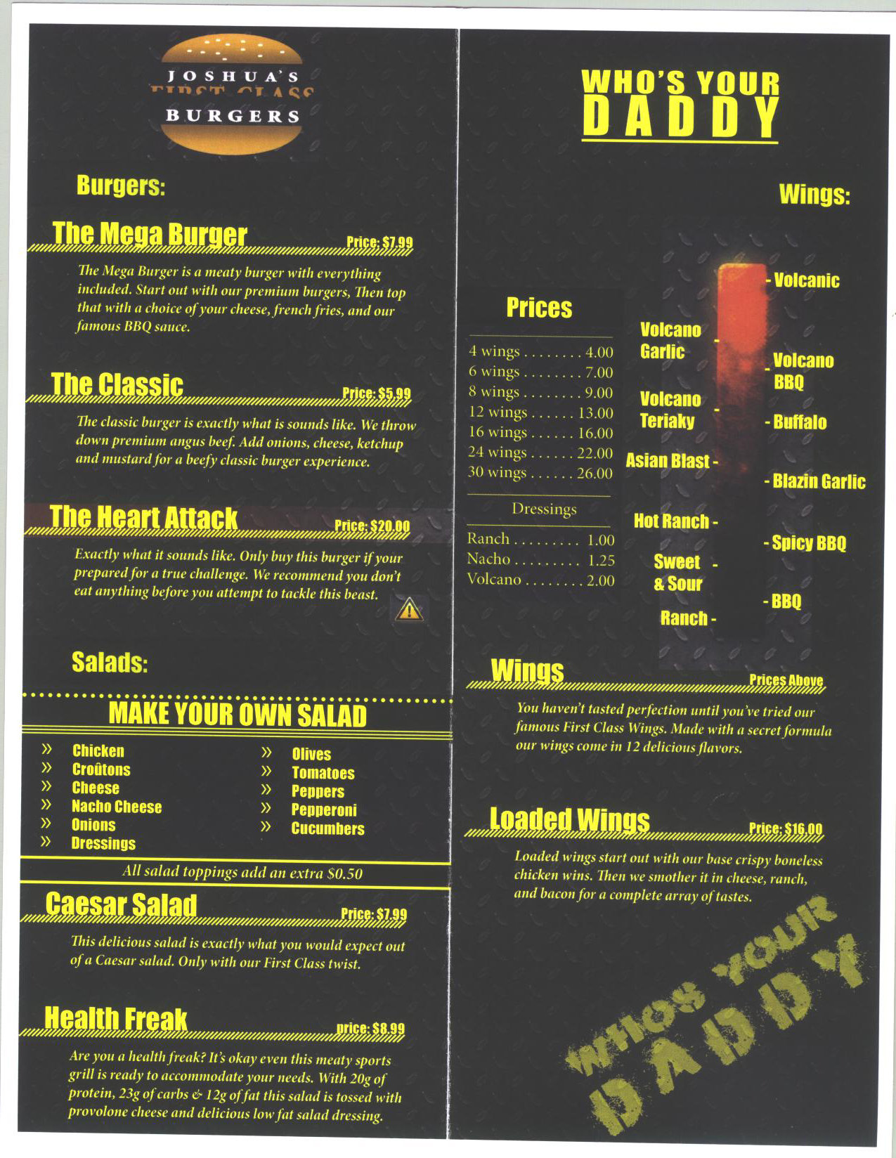
For the menu project from the start I wanted a sports grill type look. For inspiration on my menu I went to possibly the most famous sports restaurant in the state, Buffalo Wild Wings. After getting a bit of an idea of what I wanted to do for my restaurant I moved onto finding a background. I decided on a metal pattern look to add a bit of toughness to the project. From there I dimmed down the background for two reasons. First to allow for the text to appear clearer and easily readable for the customer and two, to allow for a darker, sportier feel.
I also wanted to keep a consistent yet dynamic view to the menu. For example I added the wing heat meter to both display the wing types and hotness but not being bland and just right out listing all the wings with a description. I also did this by adding a create your own salad option on the menu.
If I would go back and change anything about this project I would go back and make the backside of the menu match the inside of the menu more. On the back It was more of a white and black theme compared to the yellow and black theme. However overall I was very pleased with the outcome of this project and felt that it captured my vision fairly well.

