Website
Programs used: 
January, 2013
January, 2013
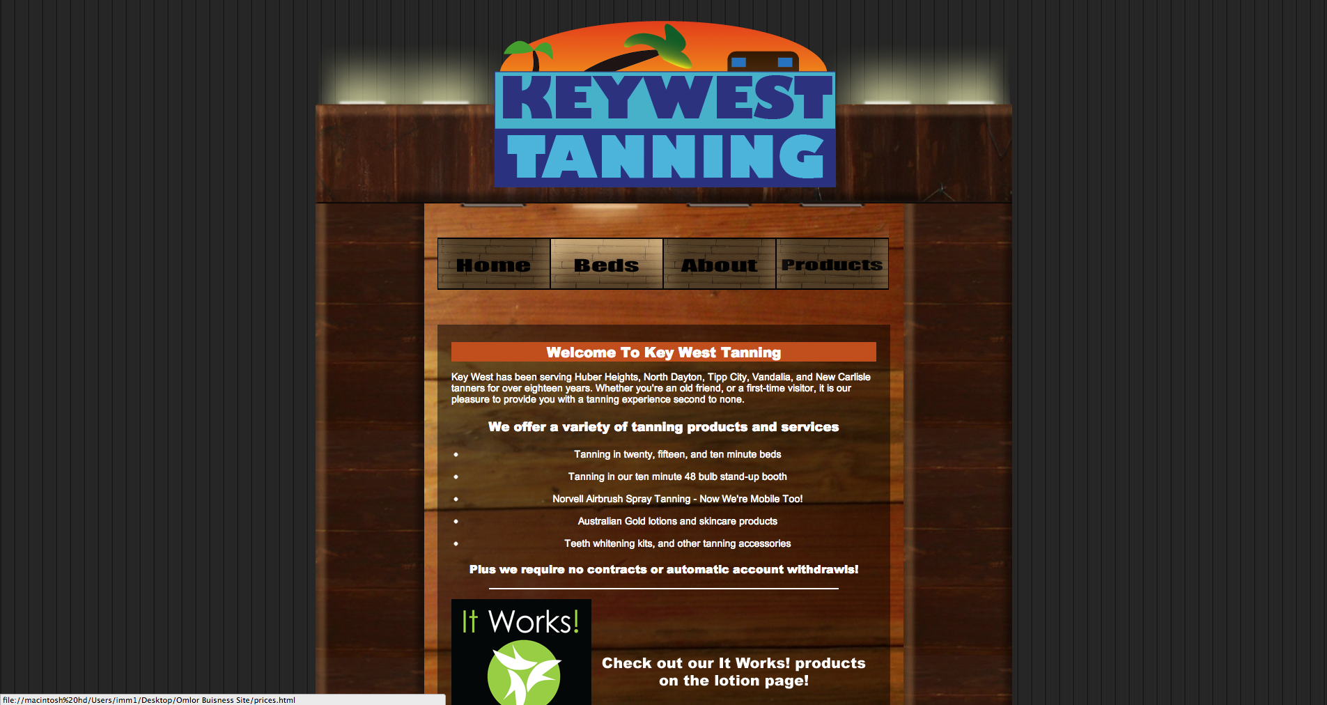
For the website I wanted too create a good balance between coding and graphics. I didn’t want the graphics to be restricted by the code and vice versa. I feel like for the most part I achieved this. My first steps i took into achieving this was creating a repeating background. Though the background’s content area isn’t perfectly repeating it is very subtle and unnoticiable. This helped me to be able to easily create dynamic content sizes without having to create and individual graphic for each and every single page. I also added various code elements that helped me modify and bend the graphics to my liking such as a gap spacer and a content area that coud seperate text from graphics.
Overall I was very pleased with my project and thought that i did a good job of creating a website that was dynamic and the set graphics did not restrain the coding in anyway or vice versa. I believe that this would make it very easy for an user to edit and modify the code with not much effort having to be put in.
If there was anything I would change about this project it’s that I would spend more time priming the graphics. For example some graphics (such as the logo and buttons) have cut offs where you can see where the image ends due to the glows on the image. However other than this all I would have done is found a better wood background with thinner borders. But in the end I was very satisfied with my results.

